
Where Mapflow ran in 2026: reading the demand for aerial imagery mapping

Mapflow is a self-serve platform. People sign up, draw a box on the map, pick a model, and get their result — usually without ever talking to us. That's the point. Increasingly they talk to Agent instead, as the product moves toward the way people actually work.
But product owners are always curious about the hidden or trending patterns in what users ask for — or they should be. And since we love maps, we put a current year of Mapflow processings onto an interactive map to see the shape of that demand.
To keep the picture undistorted we removed largest enterprise customers. What's left is ordinary customer demand across 2026.

6,521 people ran 18,745 processings over 44,433 km² of ground in 178 countries. That's roughly the land area of Estonia, mapped one shot at a time by users who mostly never spoke to us. So what does the map tell us?
👉 Explore the interactive map 👈
Switch between number of jobs, average area per processing and total area covered, flip to the raw density view, and sort the full 178-country table.
Every hotspot matters
Every hotspot is one small patch of the planet where somebody asked Mapflow to map. Bigger hotspot, more jobs.
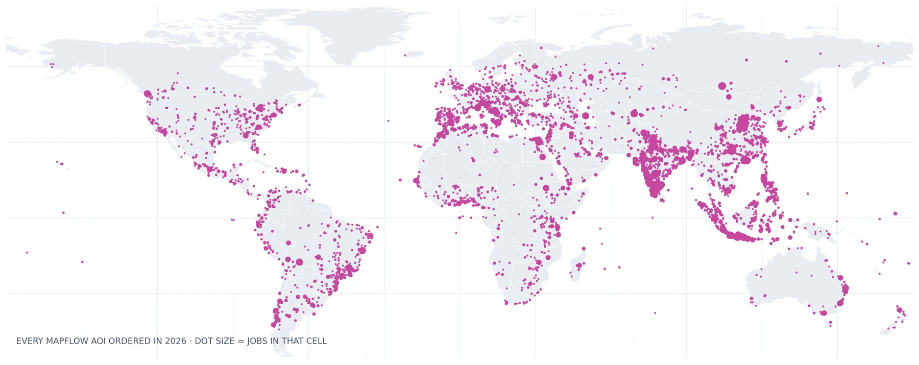 Every AOI ordered on Mapflow in 2026. Dot size = number of jobs in that cell.
Two things jump out.
The first is how urban the pattern is. This isn't a map of countries, it's a map of cities and their edges — Java's north coast, the Ganges plain, the Pearl River Delta, etc. The 🏠 Buildings mapping remains the highest demanded workflow and the map indicates it.
The second is the average processing area – in the top countries with a large share of Maplow processings it varies a lot (3-6 times) indicating the professional shift towards mapping services in the national markets. See the chart below.
Three countries are almost half the platform
Group the same data by country and it sharpens up:
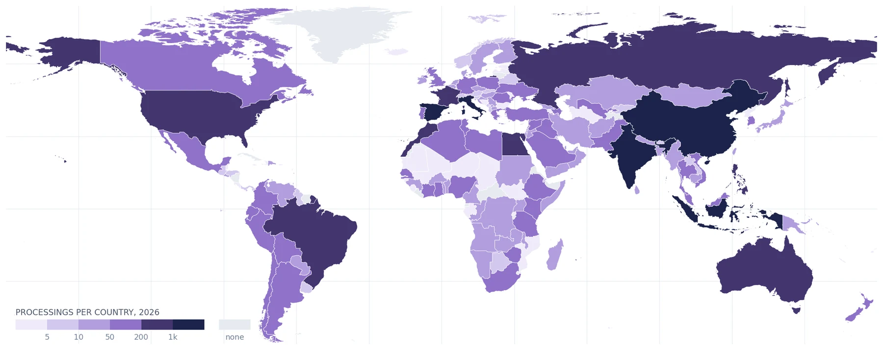 Processings per country, 2026. Grey hatching = no processings this year.
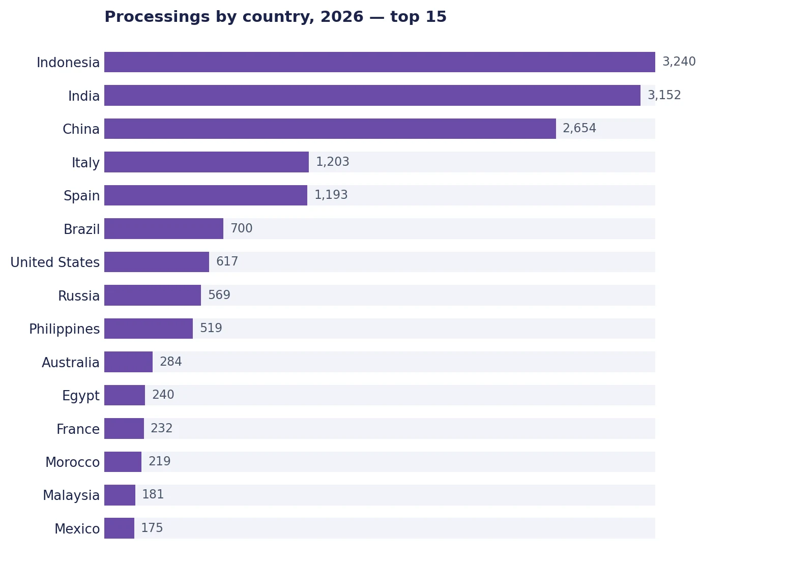
Indonesia, India and China together account for 44% of all Mapflow processings in 2026. Indonesia alone is nearly 16% — more jobs than Brazil, the United States and Russia put together.
But busy is not the same as big
Job counts only tell half the story. The other half is what people actually map for.
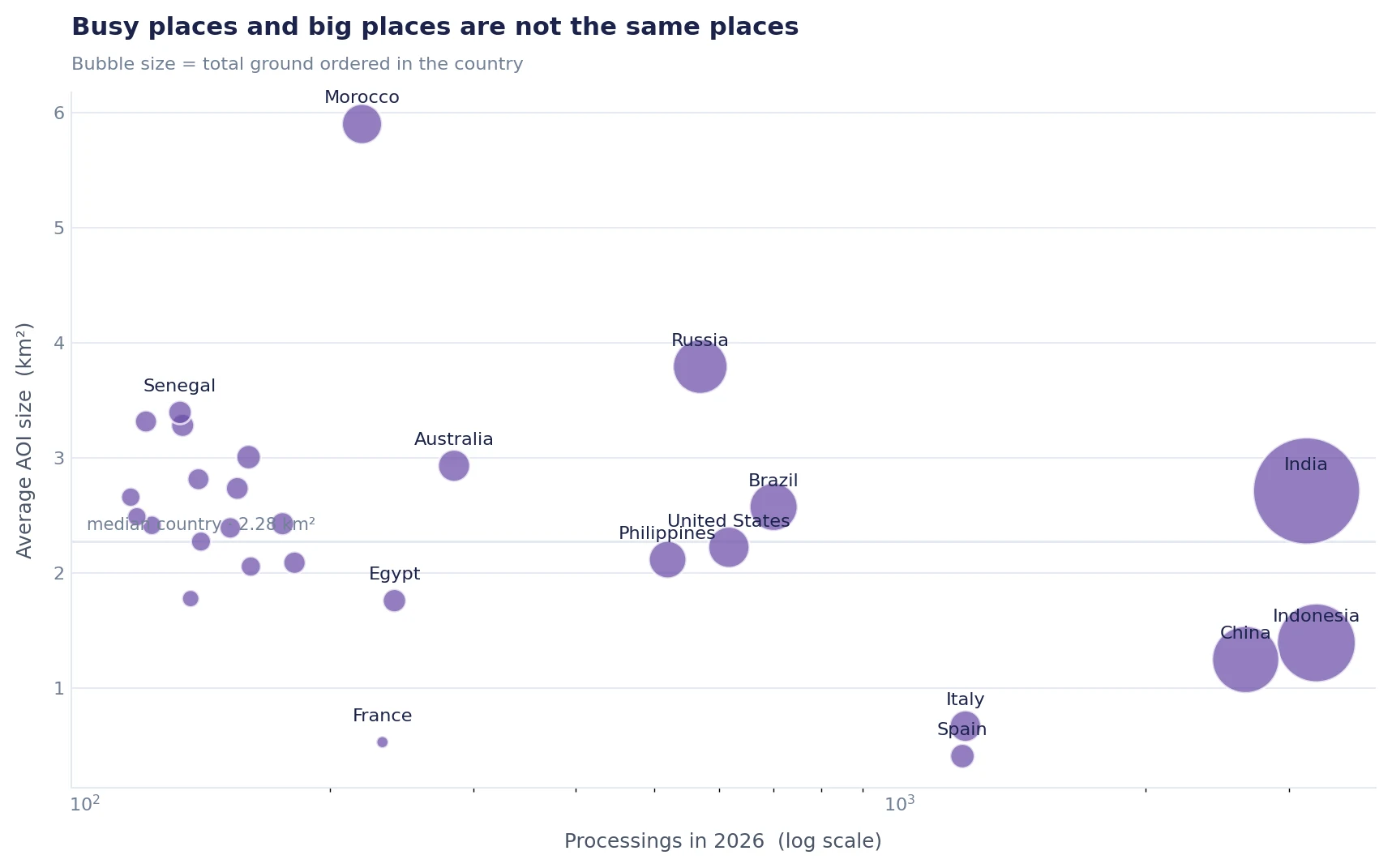
The median country orders about 2.3 km² per job. Around that median the platform splits into clearly different behaviours:
- Italy (0.67 km²) and France (0.53 km²) — high job counts, tiny areas. This looks like mapping a village, a solar farm, a construction site, a single neighbourhood. Lots of small, precise, repeated work.
- Morocco (5.9 km²), Russia (3.8 km²), Senegal (3.4 km²) — far fewer jobs, but each covers a serious chunk of ground. These look like regional mapping projects.
- India (2.7 km²) manages both: the second-highest job count and an above-median area per job. It's the only country in the top five doing high volume at scale.
A small average area looks like drone work. But area alone is not enough, let's check the My imagery data service usage by countries.
Who brings their own imagery
Mapflow can run on a basemap or connected provider, or on a raster the user uploads themselves. That second number is the interesting one, because uploading imagery means you already have an aerial or drone survey in hand.
| Own-data share of AOIs | Users who uploaded | Mean own-data AOI | |
|---|---|---|---|
| Indonesia | 50.4% | 234 | 1.16 km² |
| Italy | 5.0% | 21 | 2.76 km² |
| France | 5.6% | 4 | 0.20 km² |
Platform-wide, own-data accounts for about 27% of processings. Indonesia runs at roughly twice that rate — half of everything mapped there arrives as imagery the user brought with them.
And it is not one big customer. 234 separate Indonesian accounts uploaded imagery; the largest of them accounts for just 5% of the country's own-data jobs, and 99 accounts ran five jobs or more. The work is spread across more than 150 grid cells, with the busiest holding only 9% of it. That is what a distributed market looks like.
Italy is the instructive counter-example. It has a small-AOI signature too, but only 5% of its work runs on uploaded imagery — and 89% of Italian jobs run on the stock Mapbox basemap. Italy's small jobs are being drawn on satellite tiles, not flown. Same shape on the size chart, completely different supply chain underneath.
One caveat we'd rather state than hide: the platform records that a raster was uploaded, not where it came from. A drone orthomosaic, a manned aerial survey and a purchased satellite scene all land in the same bucket. Sub-kilometre areas from a long tail of independent accounts are a strong hint, not a proof. The clincher would be ground resolution, which is our next metric.
What does it mean for a product owner?
"Mapflow is popular in Italy for mapping on basemap imagery" and "Mapflow does a lot of regional mapping in Morocco" and "half of Indonesia's work arrives as the customer's own imagery" are all true at once, and they describe three different workflows inside the same product. That's genuinely useful when deciding what to build next — a fast small-AOI path, a cheap large-AOI path are not the same engineering or business problem.
Following the hypothesis of growing demand from the drone mapping community — the Indonesian pattern above — we spent the past month on users' own data: getting it into the web app faster, finding it through the platform's universal imagery search, and integrating My Imagery with Mapflow Agent.
Early signs are encouraging but modest. Own-imagery jobs in Indonesia are running about 20% ahead of last year's monthly pace on processings, and the month-to-month numbers are lumpy enough that we won't draw a growth curve through them yet. Did we fit the market? We'll see in the coming months.
How this map was made
Nothing here is a survey or an estimate of the market. It's our own processing log, which we keep in order to improve the product. A few decisions are worth spelling out.
We used the shape people drew, not the country they registered from. A billing address tells you where someone lives; the box they drew tells you where they work. Those are often the same country, but not always, and the second one is the interesting one.
Each area was reduced to a single point (centroid). Comparing thousands of full polygons against 255 country outlines is slow and, for this question, pointless — an AOI is small enough that one representative point inside it lands in the right country essentially always.
If your country is somewhere in that long tail and you'd like to see more of it covered, tell us what you're mapping. The distribution above is, more than anything, a record of what people asked for — and it's how we decide what to work on next.
Read also: